I was rearranging my bookcase and happened across a 1976 Readers Digest (when I moved into my Grandma’s old house I left all her books there). I flipped through and read the jokes (they had a “don’t step in the hoya” joke which I had also just seen on reddit in the last couple weeks) but what really caught my eye were the ads. Most had very stilted layout without a lot of font choice or flair. Graphic design must have been annoying back before computers.
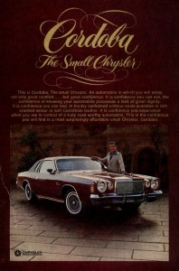
Then I saw this ad and just had to laugh!

Apparently our vision of what a small car is has changed a lot over the past 40 years. Plus that guy’s suit is just awesome.